Data Distribution
8 minute read
A single number that describes the central, typical, or representative value of a dataset, e.g, mean, median, and mode.
The mean is the average, the median is the middle value in a sorted list, and the mode is the most frequently occurring value.
- A single representative value can be used to compare different groups or distributions.
The artihmetic average of a set of numbers i.e sum all values and divide by the number of values.
\(mean = \frac{1}{n}\sum_{i=1}^{n}x_i\)
- Most common measure of central tendency.
- Represents the ‘balancing point’ of data.
- Sample mean is denoted by \(\bar{x}\), and population mean by \(\mu\).
Pros:
- Uses all datapoints in its calculation, providing a comprehensive measure.
Cons:
- Highly sensitive to outliers i.e exteme values.
- mean\((1,2,3,4,5) = \frac{1+2+3+4+5}{5} = 3 \)
- With outlier: mean\((1,2,3,4,100) = \frac{1+2+3+4+100}{5} = \frac{110}{5} = 22\)
Note: Just a single extreme value of 100 has pushed the mean from 3 to 22.
The middle value of a sorted list of numbers. It divides the dataset into 2 equal halves.
Calculation:
- Arrange the data points in ascending order.
- If the number of data points is even, the median is the average of the two middle values.
- If the number of data points is odd, the median is the middle value i.e \((\frac{n+1}{2})^{th}\) element.
Pros:
- Not impacted by outliers, making it a more robust/reliable measure, especially for skewed distributions.
Cons:
- Does NOT use all the datapoints in its calculation.
- median\((1,2,3,4,5) = 3\)
- median\((1,2,3,4,5,6) = \frac{3+4}{2} = 3.5\)
- With outlier: median\((1,2,3,4,100) = 3\)
Note: No impact of outlier.
The most frequently occurring value in a dataset.
- Dataset can have 1 mode i.e unimodal, 2 modes i.e bimodal, and more than 2 modes i.e multimodal.
- If NO value repeats, then NO mode.
Pros:
- Only measure of central tendency that can be used for categorical/nominal data, such as, gender, blood group, level of education, etc.
- It can reveal important peaks in data distribution.
Cons:
- A dataset can have multiple modes, or no mode at all, which can make mode less informative.
Quantifies how spread out or scattered the data points are.
E.g: Range, Variance, Standard Deviation, Median Absoulute Deviation(MAD), Skewness, Kurtosis, etc.
The difference between the largest and smallest values in a dataset. Simplest measure of dispersion
\(range = max - min\)
Pros:
- Easy to calculate and understand.
Cons:
- Only considers the the 2 extreme values of dataset and ignores the distribution of data in between.
- Highly sensitive to outliers.
- range\((1,2,3,4,5) = 5 - 1 = 4\)
The average of the squared distance of each value from the mean.
Measures the spread of data points.
\(sample ~ variance = s^2 = \frac{1}{n}\sum_{i=1}^{n}(x_i - \bar{x})^2\)
\(population ~ variance = \sigma^2 = \frac{1}{n}\sum_{i=1}^{n}(x_i - \mu)^2\)
Cons:
- Highly sensitive to outliers, as squaring amplifies the weight of extreme data points.
- Less intuitive to understand, as the units are square of original units.
The square root of the variance, measures average distance of data points from the mean.
- Low standard deviation indicates that the data points are clustered around the mean, whereas
high standard deviation means that the data points are spread out over a wide range.
\(s = sample ~ standard ~ deviation \)
\(\sigma = population ~ standard ~ deviation \)
- Standard Deviation\((1,2,3,4,5) = \sqrt{\frac{1}{n}\sum_{i=1}^{n}(x_i - \bar{x})^2} \) \[ = \sqrt{\frac{1}{5}((1-3)^2 + (2-3)^2 + (3-3)^2 + (4-3)^2 + (5-3)^2)} \\ = \sqrt{\frac{1}{5}(4+1+0+1+4)} \\ = \sqrt{\frac{10}{5}} = \sqrt{2} = 1.414 \]
It is the average of absolute deviation or distance of all data points from mean.
\( mad = \frac{1}{n}\sum_{i=1}^{n}|x_i - \bar{x}| \)
Pros:
- Less sensitive to outliers as compared to standard deviation..
- More intuitive and simpler to understand.
- Mean Absolute Deviation\((1,2,3,4,5) = \\ \frac{1}{5}\left(\left|1-3\right| + \left|2-3\right| + \left|3-3\right| + \left|4-3\right| + \left|5-3\right|\right) = \frac{1}{5}\left(2+1+0+1+2\right) = \frac{6}{5} = 1.2\)
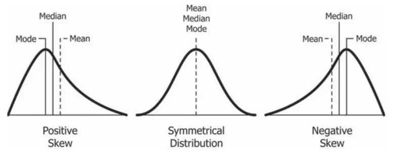
It measures the asymmetry of a data distribution.
Tells us whether the data is concentrated on one side of mean and is there a long tail stretching on the other side.
Positive Skew:
- Tail is longer on the right side of the mean.
- Bulk of data is on the left side of the mean, but there are a few very high values pulling the mean towards the right.
- Mean > Median > Mode.
Negative Skew:
- Tail is longer on the left side of the mean.
- Bulk of data is on the right side of the mean, but there are a few very high values pulling the mean towards the left.
- Mean < Median < Mode.
Zero Skew:
- Perfectly symmetrical like a normal distribution.
- Mean = Median = Mode.
- Consider the salary of employees in a company. Most employees earn a very modest salary, but a few executives earn
extremely high salaries. This dataset will be positively skewed with the mean salary > median salary.
Median salary would be a better representation of the typical salary of employees.
It measures the “tailedness” of a data distribution.
It describes how much the data is concentrated in tails (fat or thin) versus the center.
- It can tell us about the frequency of outliers in the data.
- Thick tails => More outliers.
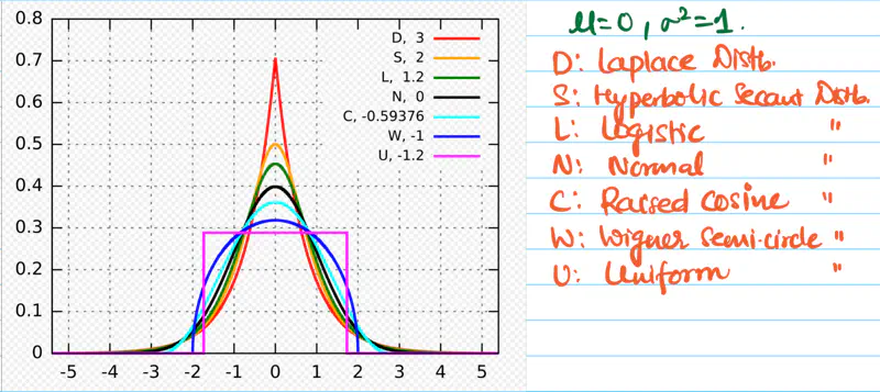
Excess Kurtosis:
Excess kurtosis is calculated by subtracting 3 from standard kurtosis in order to compare with normal distribution.
Normal distribution has kurtosis = 3.
Mesokurtic:
- Excess kurtosis = 0 i.e normal kurtosis.
- Tails are neither too thick nor too thin.
Leptokurtic:
- High kurtosis, i.e, excess kurtosis > 0 (+ve).
- Heavy or thick tails => High probability of outliers.
- Sharp peak => High concentration of data around mean.
- E.g: Student’s t-distribution, Laplace distribution, etc.
- High risk stock portfolios.
Platykurtic:
- Low kurtosis, i.e, excess kurtosis < 0 (-ve).
- Thin tails => Low probability of outliers.
- Low peak => more uniform distribution of values.
- E.g: Uniform distribution, Bernoulli(P=0.5) distribution, etc.
- Investment in fixed deposits.
E.g: Percentile, Quartile, Inter Quartile Range(IQR), etc.
It indicates the percentage of scores in a dataset that are equal to or below a specific value.
Here, the complete dataset is divided into 100 equal parts.
- \(k^{th}\) percentile => at least \(k\) percent of the data points are equal to or below the value.
- It is a relative comparison, i.e, compares a score with the entire group’s performance.
- Quartiles are basis for box plots.
- 90th percentile => score is higher than 90% of of all other test takers.
They are special percentiles that divide the complete dataset into 4 equal parts.
Q1 => 25th percentile, value below which 25% of the data falls.
Q2 => 50th percentile, value below which 50% of the data falls; median.
Q3 => 75th percentile, value below which 75% of the data falls.
- Data = \(\{1,2,3,4,5,6,7,8,9,10,100\}\) \[ Q1 = (11+1) * 1/4 = 12*1/4 = 3 \\ Q2 = (11+1) * 1/2 = 12*1/2 = 6 \\ Q3 = (11+1) * 3/4 = 12*3/4 = 9 \]
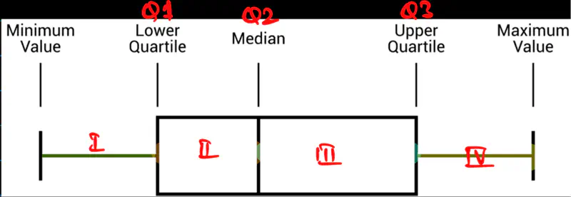
It is the single number that measures the spread of middle 50% of the data, i.e Q1-Q3.
- More robust measure of spread than range as is NOT impacted by outliers.
IQR = Q3 - Q1
- Data = \(\{1,2,3,4,5,6,7,8,9,10,100\}\) \[ Q1 = (11+1) * 1/4 = 12*1/4 = 3 \\ Q2 = (11+1) * 1/2 = 12*1/2 = 6 \\ Q3 = (11+1) * 3/4 = 12*3/4 = 9 \]
Therefore, IQR = Q3-Q1 = 9-3 = 6
IQR is a standard tool for detecting outliers.
Values that fall outside the ‘fences’ can be considered as potential outliers.
Lower fence = Q1 - 1.5 * IQR
Upper fence = Q3 + 1.5 * IQR
- Data = \(\{1,2,3,4,5,6,7,8,9,10,100\}\) \[ Q1 = (11+1) * 1/4 = 12*1/4 = 3 \\ Q2 = (11+1) * 1/2 = 12*1/2 = 6 \\ Q3 = (11+1) * 3/4 = 12*3/4 = 9 \]
IQR = Q3-Q1 = 9-3 = 6
Lower fence = Q1 - 1.5 * IQR = 3 - 9 = -6
Upper fence = Q3 + 1.5 * IQR = 9 + 9 = 18
So, any data point that is less than -6 or greater than 18 is considered as a potential outlier.
As in this example, 100 can be considered as an outlier.
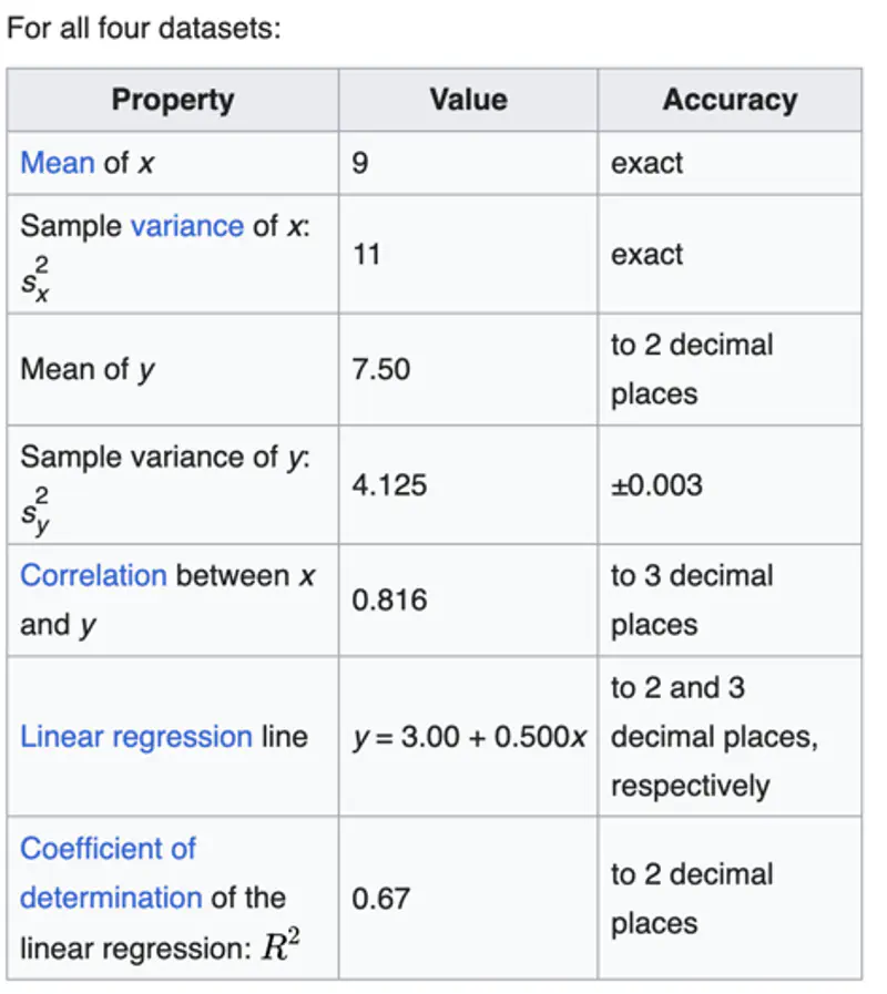
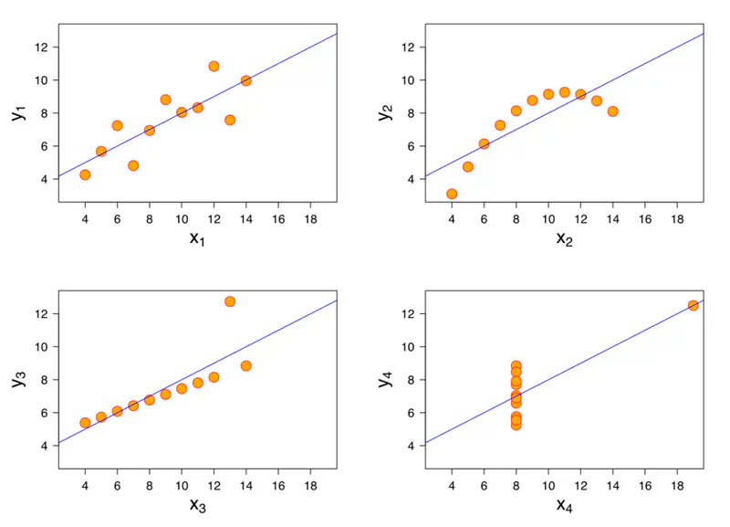
Even though the above metrics give us a good idea of the data distribution,
but still we should always plot the data and visually inspect the data distribution.
As these metrics may not provide the complete picture.
A mathematician called Francis John Anscombe has illustrated this point beautifully in his Anscombe’s Quartet.
Anscombe’s quartet:
It comprises four datasets that have nearly identical simple descriptive statistics,
yet have very different distributions and appear very different when plotted.
End of Section